20 Visualisation of lead isotope data

20.1 Learning objective
By the end of this unit you are aware about the benefits and limitations of the different ways lead isotope data can be visualised.
20.2 Prior knowledge
This section assumes familiarity with the prior learning materials on Pb isotope geochemistry, esp. Chapter 3.
20.3 Material
This section discusses different types of plots. Interactive examples of these plots allows you to explore their suitability for the different research questions on your own.
20.4 Learning content
Because lead isotopes are represented by three independent ratios, e.g., 206Pb/204Pb, 207Pb/204Pb, and 208Pb/204Pb, they can be visualised in a three dimensional geometric space. However, often only two dimensions can be represented in one plot. In addition, different ways of optically grouping and highlighting groups within the Pb isotope space exist. It is important to keep in mind that every plot has its pros and cons and there is no general consensus which is the best presentation.
All plots were created in R with support of different packages. The source of the respective chunks is provided in collapsible sections. The entire source can be copied from the raw version of this chapter through the code tools next to the chapter heading.
The same subset of a real archaeological dataset will be used as example to demonstrate how this data can be treated in different ways. The dataset is available in the GitHub repository of this book and was originally published by (Bode 2008). To avoid overloading of the plots, the subset is restricted to the archaeological objects and reference data from the region “Northern Eifel”, “Sauerland”, and “Bergisches Land”, all located in the West of Germany.
In addition, the plots share several stylistic elements, such as the colour scheme. Therefore, they can be defined for all plots.
Define common style elements
# define plotting order of regions
Roman_case$Region <- factor(Roman_case$Region, levels = c('Northern Eifel', 'Sauerland', 'Bergisches Land', 'Roman object'))
# define colours
colours <- c(viridis(3), "black")|>
setNames(c('Northern Eifel', 'Sauerland', 'Bergisches Land', 'Roman object'))
# define symbols
# in R, symbols are defined by numbers, see e.g., https://cran.r-project.org/web/packages/ggplot2/vignettes/ggplot2-specs.html#point
symbols <- c(23,24,22,3) |>
setNames(c('Northern Eifel', 'Sauerland', 'Bergisches Land', 'Roman object'))20.4.1 Binary scatter plot
The bi-plot (Figure 20.1) is by far the most common option to display lead isotope data. Since there are four isotopes of Pb, twelve combinations of isotopic ratios can be derived. The use of paired ratios depends on the instruments used and the scientific disciplines of the studies. In the early days, Pb isotopic ratios were often reported based on 206Pb-based ratios as 204Pb could not be measured precisely. However, in the 2000s, the advent of the multi-collector mass spectrometer (MC-ICP-MS) and the double- or triple-spiked technique created a huge amount of Pb isotope data with precisely measured 204Pb. Conventionally, environmental science tends to use the ratios based on 206Pb, which however generates plots with linear patterns and thus a low discrimination power (Ellam 2010). In geological literature, ratios based on 204Pb are commonplace which enable a better visualisation of system closure time (or model age) and U-Th-Pb composition (or µ and κ) of parental source(s) (Albarède et al. 2012). However, it has to be kept in mind that all two-dimensional plots incompletely represent a dataset. All twelve combination plots are suggested to be tested to view the full isotopic extent of ore deposits (Albarède et al. 2020). Ideally, the Pb isotopic ratios should be considered in a three-dimensional space.
Show the code
# select the region and all columns with isotope ratios (= all columns starting with Pb followed by three characters and a period as replacement character for the slash)
data <- subset(Roman_case, select = c('Region', grep("^Pb.{3}\\.", names(Roman_case), value = TRUE)))
colnames(data) <- c('Region', '204Pb/206Pb', '207Pb/206Pb', '208Pb/206Pb', '206Pb/204Pb', '207Pb/204Pb', '208Pb/204Pb')
# create plot
plt <- plot_ly(data = data, x = ~`206Pb/204Pb`, y = ~`207Pb/204Pb`,
split = ~Region, color = ~Region, symbol = ~Region, text = ~Region,
colors = colours, alpha = 0.75, symbols = symbols,
marker = list(line = list(color = 'rgb(0, 0, 0)', width = 1)),
hovertemplate = paste('Region: %{text}<br>',
'x: %{x}<br>',
'y: %{y}',
'<extra></extra>')
)
# set-up drop down menus for the x and y variables
# function to create the drop down menu elements
# adapted from a function provided on https://stackoverflow.com/questions/75596474/add-a-legend-to-a-plotly-plot-with-drop-down-menus-in-r
btn <- function(xLoc, m, data, xOry) { # x btn position, method, names, x or y
list(type = "list", x = xLoc, xanchor = "left", y = 1.2,
buttons = lapply(
names(data[[1]])[-1], function(k) { # iterate over names
switch (xOry,
x = {args <- list( # a list for each trace (each legend entry)
list(x = list(data[[1]][, k], data[[1]][, k], data[[1]][, k], data[[1]][, k])), # 4 lists, 4 traces
list(xaxis = list(title = k)))
},
y = {args = list( # a list for each trace (each legend
list(x = list(data[[1]][, k], data[[1]][, k], data[[1]][, k], data[[1]][, k])), # 4 lists, 4 traces
list(yaxis = list(title = list(text = k))))},
stop("xOrY must be either 'x' or 'y'.")
)
list(method = m, label = k, args = args)
}
)
)
}
# split regions into separate datasets
regions <- split(data, data$Region)
# add dropdown menus to plot
plt <- plt %>% layout(
xaxis = list(title = "206Pb/204Pb"),
yaxis = list(title = "207Pb/204Pb"),
updatemenus = list(btn(.2, "update", regions, "x"),
btn(.8, "update", regions, "y")),
showlegend = TRUE,
annotations = list(
list(
text = "<b>X-Axis:</b>", x=0.04, y=1.18,
xref='paper', yref='paper',xanchor = "left", showarrow=FALSE
),
list(
text = "<b>Y-Axis:</b>", x=0.63, y=1.18,
xref='paper', yref='paper',xanchor = "left", showarrow=FALSE
)
)
)
# draw plot
plt20.4.2 Bi-plot using geological-informed parameters
Instead of isotopic ratios, Albarède et al. (2012) advocate the use of calculated geological model parameters, namely the model age (T), U/Pb (μ), and Th/U (κ) to discriminate potential ore sources in provenance studies (Figure 20.2). As shown in chapter 3, 206Pb, 207Pb, and 208Pb are generated by radioactive decay of their parental isotopes 238U, 235U, and 232Th, respectively. We can therefore calculate the model age, 238U/204Pb and 232Th/238U from the Pb isotope ratios determined for a given sample using the equations provided in Albarède et al. (2012) or any other of the Pb isotope models mentioned in chapter 3 by using, e.g., an R script.
Show the code
# select columns Age, Mu, Kappa, Region and rename them
data <- subset(Roman_case, select=c('Region', 'Age', 'Mu', 'Kappa')) |>
na.omit()
colnames(data) <- c('Region', 'Age','U/Pb','Th/U')
# create plot
plt <- plot_ly(data = data, x = ~Age, y = ~`U/Pb`,
split = ~Region, color = ~Region, symbol = ~Region, text = ~Region,
colors = colours, alpha = 0.75, symbols = symbols,
marker = list(line = list(color = 'rgb(0, 0, 0)', width = 1)),
hovertemplate = paste('Region: %{text}<br>',
'x: %{x}<br>',
'y: %{y}',
'<extra></extra>')
)
# set-up drop down menus for the x and y variables.
# The function 'btn', defined in the code chunk above, is reused.
# split regions into separate datasets
regions <- split(data, data$Region)
# add dropdown menus to plot
plt <- plt %>% layout(
xaxis = list(title = "Age"),
yaxis = list(title = "U/Pb"),
updatemenus = list(btn(.2, "update", regions, "x"),
btn(.8, "update", regions, "y")),
showlegend = TRUE,
annotations = list(
list(
text = "<b>X-Axis:</b>", x=0.04, y=1.18,
xref='paper', yref='paper',xanchor = "left", showarrow=FALSE
),
list(
text = "<b>Y-Axis:</b>", x=0.63, y=1.18,
xref='paper', yref='paper',xanchor = "left", showarrow=FALSE
)
)
)
# draw plot
plt20.4.3 Bi-plot with 90% confidence ellipse
The increasing amount of available Pb isotope analyses resulted in the issue of how to effectively present overlapping data. One way to circumvent this problem is the creation of so-called “ore fields” that represent the extent of Pb isotopic variation given that the data follow a normal distribution. Some researchers have resorted to the 90% confidence ellipse (Figure 20.3) as the reference for ore sourcing (Stos-Gale et al. 1997). This technique was severely criticised by Baxter and Gale (1998), who demonstrated the non-normality of Pb isotope data in a number of instances. The 90% confidence ellipse is no longer considered suitable for representing an ore Pb isotopic population.
Show the code
# select the region and all 204Pb-normalised isotope ratios
data <- subset(Roman_case, select = c('Region', grep("^Pb.{3}\\.Pb204", names(Roman_case), value = TRUE)))
colnames(data) <- c('Region', '206Pb/204Pb', '207Pb/204Pb', '208Pb/204Pb')
# create plot for 207Pb/204Pb vs 206Pb/204Pb
p_207 <- ggplot(data, aes(x = `206Pb/204Pb`, y = `207Pb/204Pb`, shape = Region, fill = Region)) +
geom_point(stroke = 0.2,size = 2.5, color = "black", alpha = 0.75) +
scale_shape_manual(values = symbols) +
scale_fill_manual(values = colours) +
stat_ellipse(level = 0.9, type = "t", linewidth = 0.1, show.legend = NA) +
labs(x = expression(""^"206"*"Pb/"^"204"*"Pb"),
y = expression(""^"207"*"Pb/"^"204"*"Pb")) +
theme_bw()
p_207 <- ggplotly(p_207, tooltip = c("x", "y", "fill")) %>%
layout(xaxis = list(title = "<sup>206</sup>Pb/<sup>204</sup>Pb"),
yaxis = list(title = "<sup>207</sup>Pb/<sup>204</sup>Pb"),
legend = list(title = "", font = list(size = 10), orientation = "h", xanchor = "center", x = 0.5, y = 1.175)
)
# create plot for 208Pb/204Pb vs 206Pb/204Pb
p_208 <- ggplot(data, aes(x = `206Pb/204Pb`, y = `208Pb/204Pb`, shape = Region, fill = Region)) +
geom_point(stroke = 0.2,size = 2.5, color = "black", alpha = 0.75) +
scale_shape_manual(values = symbols) +
scale_fill_manual(values = colours) +
stat_ellipse(level = 0.9, type = "t", linewidth = 0.1, show.legend = NA) +
labs(x = expression(""^"206"*"Pb/"^"204"*"Pb"),
y = expression(""^"208"*"Pb/"^"204"*"Pb")) +
theme_bw()
p_208 <- ggplotly(p_208, tooltip = c("x", "y", "fill")) %>%
layout(xaxis = list(title = "<sup>206</sup>Pb/<sup>204</sup>Pb"),
yaxis = list(title = "<sup>208</sup>Pb/<sup>204</sup>Pb"),
legend = list(title = "", font = list(size = 10), orientation = "h", xanchor = "center", x = 0.5, y = 1.175)
)
# draw plots
p_207
p_20820.4.4 Binary plot with the kernel density estimation
Due to the non-normality of Pb isotope data, both Baxter et al. (1997) and Scaife et al. (1999) advocated the use of more robust kernel density estimates (KDEs) to display the isotopic extent of orefields (Figure 20.4). KDEs are a non-parametric method to transform continuous data into a smoothed probability density function. KDEs offer three main advantages:
- They do not assume the normality of data;
- They can produce smoother distributions than conventional histograms, whose appearance is significantly affected by the choices of bin width and the start/end points of bins; and
- They can represent data in a multidimensional space and enable users to effectively compare different datasets either graphically or mathematically.
Given these advantages, the KDE method has become popular in recent publications of archaeological sciences (Hsu et al. 2018).
Show the code
# select individual regions/assemblages
regions <- c("Northern Eifel", "Sauerland", "Bergisches Land")
# define levels, to be read as 100% - value, i.e. '5%' indicates 95% contour
levels <- c("5%", "25%", "50%")
# initiate data
data_kde206v207 <- vector(mode = "list", length = length(regions))
names(data_kde206v207) <- regions
data_kde206v208 <- vector(mode = "list", length = length(regions))
names(data_kde206v208) <- regions
for (i in regions) {
# subset data
data_region <- Roman_case[Roman_case$Region == i, ]
# compute KDE
data_region_kde206v207 <- ks::kde(data_region[c("Pb206.Pb204", "Pb207.Pb204")], compute.cont = TRUE,gridsize = 1024)
data_region_kde206v208 <- ks::kde(data_region[c("Pb206.Pb204", "Pb208.Pb204")], compute.cont = TRUE,gridsize = 1024)
# compute contour lines
data_region_kde206v207_levels <- data_region_kde206v207$cont[levels]
data_region_kde206v207_contour <- with(data_region_kde206v207, contourLines(x = eval.points[[1]], y = eval.points[[2]], z = estimate, levels = data_region_kde206v207_levels))
names(data_region_kde206v207_contour) <- paste0(i, seq_along(data_region_kde206v207_contour))
data_region_kde206v207_contour <- Map(c, data_region_kde206v207_contour, group = names(data_region_kde206v207_contour))
data_region_kde206v207_contour <- do.call("rbind", lapply(data_region_kde206v207_contour, data.frame))
data_region_kde206v207_contour$level_percent <- names(data_region_kde206v207_levels)[match(data_region_kde206v207_contour$level, data_region_kde206v207_levels)]
data_region_kde206v208_levels <- data_region_kde206v208$cont[levels]
data_region_kde206v208_contour <- with(data_region_kde206v208, contourLines(x = eval.points[[1]], y = eval.points[[2]], z = estimate, levels = data_region_kde206v208_levels))
names(data_region_kde206v208_contour) <- paste0(i, seq_along(data_region_kde206v208_contour))
data_region_kde206v208_contour <- Map(c, data_region_kde206v208_contour, group = names(data_region_kde206v208_contour))
data_region_kde206v208_contour <- do.call("rbind", lapply(data_region_kde206v208_contour, data.frame))
data_region_kde206v208_contour$level_percent <- names(data_region_kde206v208_levels)[match(data_region_kde206v208_contour$level, data_region_kde206v208_levels)]
data_kde206v207[[i]] <- data_region_kde206v207_contour
data_kde206v208[[i]] <- data_region_kde206v208_contour
}
# crunch list into data frame
data_kde206v207 <- Map(cbind, data_kde206v207, Region = names(data_kde206v207))
data_kde206v207 <- do.call("rbind", data_kde206v207)
data_kde206v208 <- Map(cbind, data_kde206v208, Region = names(data_kde206v208))
data_kde206v208 <- do.call("rbind", data_kde206v208)
# plots
plot_kde206v207 <- ggplot() +
geom_point(data = Roman_case[Roman_case$Region == "Roman object", ], aes(x = Pb206.Pb204, y = Pb207.Pb204, colour = Region), shape = 3, size = 2.3) +
geom_polygon(data = data_kde206v207, mapping = aes(x = x, y= y, group = group, colour = Region, fill = Region, alpha = level_percent)) +
scale_colour_manual(name = NULL, limits = names(colours), values = colours) +
scale_fill_manual(name = NULL, limits = names(colours), values = colours) +
scale_alpha_discrete(range = c(0.1, 0.3), guide = "none") +
scale_x_continuous(name = expression(""^"206"*"Pb/"^"204"*"Pb"), limits = c(18, 18.6), breaks = seq(18, 18.6, by = 0.1)) +
scale_y_continuous(name = expression(""^"207"*"Pb/"^"204"*"Pb"), limits = c(15.5, 15.8), breaks = seq(15.5, 15.8, by = 0.05)) +
guides(colour = guide_legend(position = "inside")) +
theme_bw() +
theme(panel.grid.minor = element_blank(),
axis.text = element_text(size = 10),
axis.title = element_text(size = 14),
legend.position.inside = c(0.76, 0.11)
)
plot_kde206v208 <- ggplot() +
geom_point(data = Roman_case[Roman_case$Region == "Roman object", ], aes(x = Pb206.Pb204, y = Pb208.Pb204, colour = Region), shape = 3, size = 2.3) +
geom_polygon(data = data_kde206v208, mapping = aes(x = x, y = y, group = group, colour = Region, fill = Region, alpha = level_percent)) +
geom_point(data = Roman_case[Roman_case$Region == "Roman object", ], aes(x = Pb206.Pb204, y = Pb208.Pb204, colour = Region), shape = 3, size = 2.3) +
scale_colour_manual(name = NULL, limits = names(colours), values = colours) +
scale_fill_manual(name = NULL, limits = names(colours), values = colours) +
scale_alpha_discrete(range = c(0.1, 0.3), guide = "none") +
scale_x_continuous(name = expression(""^"206"*"Pb/"^"204"*"Pb"), limits = c(18, 18.6), breaks = seq(18, 18.6, by = 0.1)) +
scale_y_continuous(name = expression(""^"208"*"Pb/"^"204"*"Pb"), limits = c(37.9, 38.8), breaks = seq(38, 39, by = 0.1)) +
guides(colour = guide_legend(position = "inside")) +
theme_bw() +
theme(panel.grid.minor = element_blank(),
axis.text = element_text(size = 10),
axis.title = element_text(size = 14),
legend.position.inside = c(0.76, 0.11)
)
# convert to plotly
plot_kde206v207 <- ggplotly(plot_kde206v207) %>%
layout(xaxis = list(title = "<sup>206</sup>Pb/<sup>204</sup>Pb"),
yaxis = list(title = "<sup>207</sup>Pb/<sup>204</sup>Pb"),
legend = list(title = "", font = list(size = 10), orientation = "h", xanchor = "center", x = 0.5, y = 1.175)
)
plot_kde206v208 <- ggplotly(plot_kde206v208) %>%
layout(xaxis = list(title = "<sup>206</sup>Pb/<sup>204</sup>Pb"),
yaxis = list(title = "<sup>207</sup>Pb/<sup>204</sup>Pb"),
legend = list(title = "", font = list(size = 10), orientation = "h", xanchor = "center", x = 0.5, y = 1.175)
)
# modify legends
for (i in seq_along(plot_kde206v207$x$data)) {
if (!grepl("25%|Roman", plot_kde206v207$x$data[[i]]$name)) {plot_kde206v207$x$data[[i]]$showlegend <- FALSE}
for (k in unique(Roman_case$Region)) {
if (grepl(k, plot_kde206v207$x$data[[i]]$name)) {
plot_kde206v207$x$data[[i]]$name <- k
plot_kde206v207$x$data[[i]]$legendgroup <- k
}
}
}
for (i in seq_along(plot_kde206v208$x$data)) {
if (!grepl("25%|Roman", plot_kde206v208$x$data[[i]]$name)) {plot_kde206v208$x$data[[i]]$showlegend <- FALSE}
for (k in unique(Roman_case$Region)) {
if (grepl(k, plot_kde206v208$x$data[[i]]$name)) {
plot_kde206v208$x$data[[i]]$name <- k
plot_kde206v208$x$data[[i]]$legendgroup <- k
}
}
}
# draw plots
plot_kde206v207
plot_kde206v20820.4.5 Ternary diagram
This plotting method was first utilised by Cannon et al. (1961) who aimed to understand the principles of isotopic variations in ore lead. Raw isotopic ratios were expressed as relative abundances of 206Pb, 207Pb, 208Pb summed up to 100% by leaving out 204Pb. The transformed data were plotted as trilinear coordinates. The choice of represented masses was justified by the incapability of precisely determining the amount of 204Pb due to its low natural abundance of only 1.4% (uncertainties ~2.5%). These ternary diagrams were proposed as a solution to overcome the problem of analytically fundamentally biased data. However, they were rendered irrelevant with the advent of improved analytical techniques and the development of error correction models, which greatly increased precision (Taylor et al. 2015). A good example of using ternary diagrams is provided in (Hsu and Sabatini 2019).
The raw isotopic ratios are mathematically converted to three individual Pb compositions using the following equations:
\[ ^{206}Pb = \frac{\left(\frac{^{206}Pb}{^{204}Pb}\right) \cdot 100}{\left(\frac{^{206}Pb}{^{204}Pb}\right) + \left(\frac{^{207}Pb}{^{204}Pb}\right) + \left(\frac{^{208}Pb}{^{204}Pb}\right)} \]
\[ ^{207}Pb = \frac{\left(\frac{^{207}Pb}{^{204}Pb}\right) \cdot 100}{\left(\frac{^{206}Pb}{^{204}Pb}\right) + \left(\frac{^{207}Pb}{^{204}Pb}\right) + \left(\frac{^{208}Pb}{^{204}Pb}\right)} \]
\[ ^{208}Pb = \frac{\left(\frac{^{208}Pb}{^{204}Pb}\right) \cdot 100}{\left(\frac{^{206}Pb}{^{204}Pb}\right) + \left(\frac{^{207}Pb}{^{204}Pb}\right) + \left(\frac{^{208}Pb}{^{204}Pb}\right)} \]
Figure 20.5 displays a ternary scatter plot.
Show the code
## select region and columns with relative abundance of single isotopes
data <- subset(Roman_case, select = c('Region', grep("^Pb.{3}$", names(Roman_case), value = TRUE)))
# create plot
plt <- plot_ly(data = data, a = ~Pb206, b = ~Pb207, c = ~Pb208,
split = ~Region, color = ~Region, symbol = ~Region, text = ~Region,
type = "scatterternary",
colors = colours, alpha = 0.75, symbols = symbols,
marker = list(line = list(color = 'rgb(0, 0, 0)', width = 1)),
hovertemplate = paste('Region: %{text}<br>',
'<sup>206</sup>Pb (%): %{a}<br>',
'<sup>207</sup>Pb (%): %{b}<br>',
'<sup>208</sup>Pb (%): %{c}',
'<extra></extra>')
) |>
layout(ternary = list(
sum = 100,
aaxis = list(title = "<sup>206</sup>Pb (%)",
tickfont = list(size = 10),
tickangle = 60,
ticklen = 10,
min = min(data$Pb206)-0.05,
max = max(data$Pb206)+0.05
),
baxis = list(title = "<sup>207</sup>Pb (%)",
tickfont = list(size = 10),
tickangle = -60,
ticklen = 10,
min = min(data$Pb207)-0.05,
max = max(data$Pb207)+0.05
),
caxis = list(title = "<sup>208</sup>Pb (%)",
tickfont = list(size = 10),
ticklen = 10,
min = min(data$Pb208)-0.05,
max = max(data$Pb208)+0.05
)
),
legend = list(title = "", x = 0.75, y = 1.125)
)
# draw plot
plt20.4.6 Ternary diagram with the kernel density estimation
KDE contour plots like in Figure 20.4 can also be generated for ternary diagrams (Figure 20.6). This helps us to better visualise the isotopic distribution of ore populations when many data are presented. However, the ternary KDE, in a sense, is not equal to the three-dimensional KDE. It is rather a regular KDE that is truncated to the ternary triangle.
Show the code
# create plot
plt <- ggtern(data = data, aes(x = Pb207, y = Pb206, z = Pb208, color = Region, fill = Region))+
geom_density_tern(data = data[data$Region != "Roman object", ], n = 1000, bins=10, alpha = 1) +
geom_point(data = data[data$Region == "Roman object", ], size = 2, alpha = 0.5) +
scale_colour_manual(values = colours) +
scale_T_continuous (name = expression({}^206*"Pb (%)"), limits = c(0.258,0.252)) +
scale_L_continuous (name = expression({}^207*"Pb (%)"), limits = c(0.213,0.219)) +
scale_R_continuous (name = expression({}^208*"Pb (%)"), limits = c(0.529,0.535)) +
theme_bw() +
theme(legend.position.inside = c(0.95,0.95),
legend.justification = c(1,1),
legend.box.just = 'left',
legend.text = element_text(size = 12),
legend.key = element_rect(fill = NA, colour=NA),
plot.margin = unit(c(0,0,0,0), "mm")
)
# draw plot
plt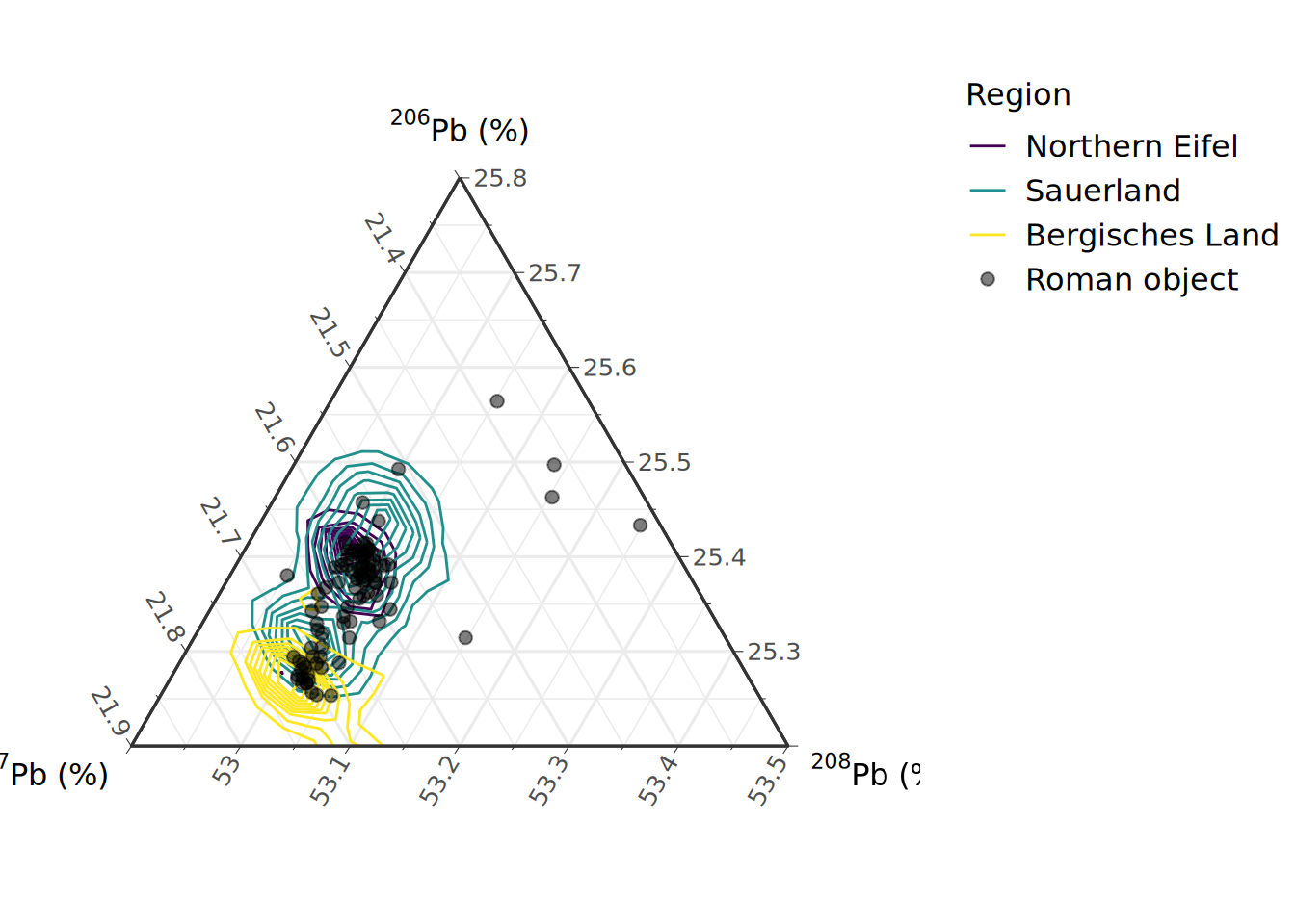
20.4.7 Three-dimensional plot
The use of any single bivariate plot is insufficient for provenancing and is visually confusing when the ratios overlap. Therefore, additional diagrams are needed to show other combinations of isotopes. Three-dimensional plots represent the distribution of data in a three dimensional space (Figure 20.7) which has a higher discrimination power and is therefore better suited for provenance studies. The downside is that it is inherently difficult to read a 3D diagram and, therefore, a rotatable version is highly recommended.
Show the code
# extract data
data <- subset(Roman_case, select = c('Region', grep("^Pb.{3}\\.Pb204", names(Roman_case), value = TRUE)))
# Create plot
plot_ly(data,
x = ~Pb206.Pb204,
y = ~Pb207.Pb204,
z = ~Pb208.Pb204,
color = ~Region,
colors = colours,
symbol = ~Region,
symbols = c("diamond", "triangle-up", "square", "cross"),
text = ~Region,
hovertemplate = paste('Region: %{text}<br>',
'x: %{x}<br>',
'y: %{y}<br>',
'z: %{z}',
'<extra></extra>')
) |>
layout(scene = list(xaxis = list(title = '<sup>206</sup>Pb/<sup>204</sup>Pb'),
yaxis = list(title = '<sup>207</sup>Pb/<sup>204</sup>Pb'),
zaxis = list(title = '<sup>208</sup>Pb/<sup>204</sup>Pb'),
aspectmode='cube'
)
)20.4.8 Three-dimensional plot with kernel density estimation
This plotting method applies kernel density estimation to a three-dimensional diagram (Figure 20.8). It can help to delineate reference datasets with which targeted artefacts can be compared. Beardah and Baxter (1999) pioneered the application of a three-dimensional kernel plot in Pb isotope studies and suggested a sample size of 20 as an acceptable value. However, they also realised that larger sample sizes, ranging from 40 to 60, would be necessary if the population from which the sample is drawn is not normally distributed. To construct the 3D kernel plot using R, we modified the code from Ma et al. (2022).
Show the code
# select individual regions/assemblages
regions <- unique(data$Region)
# define levels, to be read as 100% - value, i.e. '5%' indicates 95% contour
levels <- c(95, 75, 50)
# initiate data and plot
data_kde3d <- vector(mode = "list", length = length(regions))
names(data_kde3d) <- regions
par3d(windowRect = c(0, 0, 1200, 800))
# calculate KDEs for each region
for (i in regions) {
# subset data
data_region <- data[data$Region == i, ]
data_region$Region <- NULL # remove region for computation of KDEs
# compute KDE
data_region.pi <- Hpi(data_region, binned = TRUE) ## b is a matrix of x,y,z points
data_kde3d[[i]] <- kde(data_region, H = data_region.pi)
# plot KDE
if (i != "Roman object") {
plot(data_kde3d[[i]], display = "rgl", cont = levels,
col = colours[i], col.cont = colours[i], xlab = "", ylab = "", zlab = "",
add = TRUE, drawpoints = FALSE, box=FALSE, axes=FALSE
)
} else{
plot(data_kde3d[[i]], display = "rgl", cont = 0,
col.pt = colours[i], size = 6, pch = 3, alpha = 1, xlab = "", ylab = "", zlab = "",
add = TRUE, drawpoints = TRUE, box = TRUE, axes = FALSE
)
}
}
# decorate plot
title3d(xlab = expression({}^206*"Pb/"*{}^204*"Pb"),
ylab = expression({}^207*"Pb/"*{}^204*"Pb"),
zlab = expression({}^208*"Pb/"*{}^204*"Pb")
)
bbox3d(color=c("grey","black"), emission="white", specular="lightgrey", shininess=5, alpha=0.8 )
# add legend
legend3d("topright", legend = regions, pch = 16, col = colours, cex = 2, inset = 0)20.5 Self check
- Nowadays, which pairs of Pb isotopes are better suited to discriminate the isotopic ratios of artefacts and ore samples?
- What statistical assumptions are appropriate to describe the distribution of Pb isotopic data in an assemblage?
- What are the pros and cons when it comes to a three-dimensional diagram?
20.6 Further reading
- Albarede F, Blichert-Toft J, Gentelli L, Milot J, Vaxevanopoulos M, Klein S, Westner KJ, Birch T, Davis G, Callataÿ F de (2020) A miner’s perspective on Pb isotope provenances in the Western and Central Mediterranean. J. Archaeol. Sci. 121:105194. https://doi.org/10.1016/j.jas.2020.105194
- Blichert-Toft J, Delile H, Lee C-T, Stos-Gale Z, Billström K, Andersen T, Hannu H, Albarède F (2016) Large-scale tectonic cycles in Europe revealed by distinct Pb isotope provinces. Geochem. Geophys. Geosyst. 17:3854–3864. https://doi.org/10.1002/2016GC006524
- Hsu Y-K, Sabatini BJ (2019) A geochemical characterization of lead ores in China: An isotope database for provenancing archaeological materials. PLoS ONE 14:e0215973. https://doi.org/10.1371/journal.pone.0215973